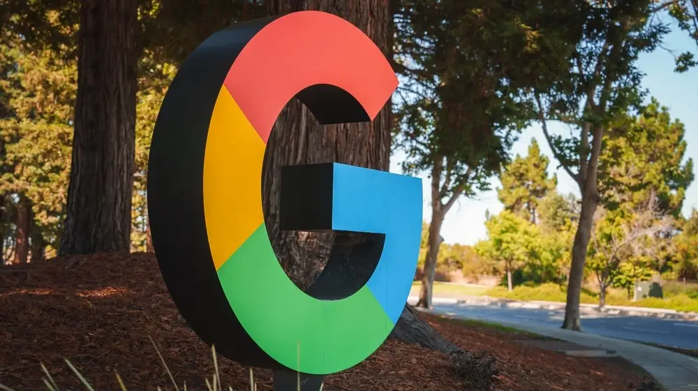

Google has unveiled a refreshed version of its iconic “G” logo, marking the first major update since its debut a decade ago.
Originally designed to unify the brand across platforms, apps, and devices, the four-color “G” has now been reimagined with brighter hues and a subtle gradient effect.
The new design first appeared earlier this year to represent Google Search and will now serve as the company-wide symbol.
This brighter, gradient “G” reflects Google’s transformation in the AI era, signaling both creative energy and technological innovation.
While staying true to the brand’s signature colors, the update aligns with the company’s broader push to integrate AI into products and services.
The refreshed design debuted in June with Gemini Spark and will continue rolling out across Google’s ecosystem in the coming months.
You may also want to check out some of our other recent updates.
Wanna know what’s trending online every day? Subscribe to Vavoza Insider to access the latest business and marketing insights, news, and trends daily with unmatched speed and conciseness! 🗞️